Big data increasingly drives the business world. However, the insights from data are only valuable if decision-makers can understand them. This is sometimes a challenge for non-technical stakeholders, whose forte in other areas might not extend to interpreting complex technical information.
Thus, visualization is critical to communicating effectively and carrying everyone along in decision-making. By leveraging the principles of visual perception, we can transform complex data into accessible and actionable insights, empowering non-technical stakeholders to contribute more meaningfully to business success.
Understanding the Audience: Non-Technical Stakeholders
Non-technical stakeholders often bring a variety of perspectives that are essential for well-rounded decision-making. However, one of the main challenges in dealing with them is the potential communication gap.
Closing the communication gap is crucial because non-technical stakeholders often hold significant decision-making power (whether as executives and upper management, investors and shareholders, marketing teams, HR personnel, end-users and customers, government, regulators, etc.)
Additionally, non-technical stakeholders can be strong advocates for technical projects if they understand and believe in the value they bring to the business. So, gaining their support is often critical for securing resources and overcoming resistance within the organization.
In the software development context, Andress Zunino advocates for developers to be business-savvy in order to communicate effectively with non-technical stakeholders. As he puts it, “This alignment is crucial for developing products that function well and drive business value.”
The Power of Visuals in Data Analytics
Data visualization is not just constructing graphs with numbers; there’s a real science behind it, and understanding the psychology of visualization enhances communication using available visual tools.
In cognitive psychology, visual perception involves interpreting the environment through our sense of sight. When light falls on the retina, it is converted into neural signals, which are then processed by various parts of the brain. Various factors in this process make human beings process visuals more effectively than raw text.
For one, our brains can process multiple aspects of a visual scene simultaneously, such as color, shape, depth, motion, etc. This is known as parallel processing, and it allows us to understand complex visual information quickly. More so, humans are naturally good at recognizing patterns and shapes, which is why visual data is so effective.
Overall, visual information tends to be more memorable than text. In what is known as the “picture superiority effect,” studies have shown that people remember images better than words.
Advanced Best Practices for Creating Effective Data Visualizations
Most guidelines for effective data visualizations focus on the basics, such as simplicity, choosing the right chart, color guides, and so on. While these are all good, there are higher-level best practices that can transform your visualizations from mere charts into powerful tools for communication and decision-making.
The following principles, thoughtfully applied, will elevate how you present your data to non-technical stakeholders.
Visual Metaphors
Integrating visual metaphors that align with the data‘s context often makes the information more accessible and less intimidating to non-technical stakeholders. For instance, if visualizing financial growth, instead of a standard line graph, consider using a plant growing over time, where leaves represent profits.
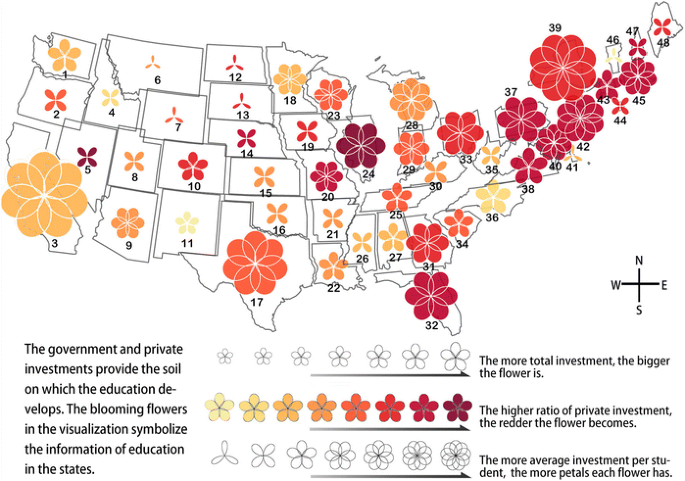
According to a paper by the VISVAR Research group, metaphorical visual mapping is a flexible process that enables the adaptation of visualizations to various applications and target audiences. Achieving this strategy requires careful execution to avoid coming across as gimmicky, but when done right, it can make data more memorable.
Story-Driven Layout
Visualizations must be organized to follow a narrative arc that can guide the viewer through the data in a more engaging way. This involves structuring the visuals to include a beginning (context), middle (insight), and end (conclusion or call to action).
It makes it easier for non-technical stakeholders to follow the progression from data points to insights rather than confronting them with overwhelming information all at once. As Catherine Cote of Harvard Business School Online puts it, storytelling is important in data visualization in order to “put data insights into context for, and inspire action from, your audience.”
Contextual Annotations
Basic labels and legends are boring. However, embedding contextual annotations directly within the visualization can really aid reception. For example, use thought bubbles or side notes that mimic a person’s commentary, guiding the viewer’s attention with an explanatory tone.
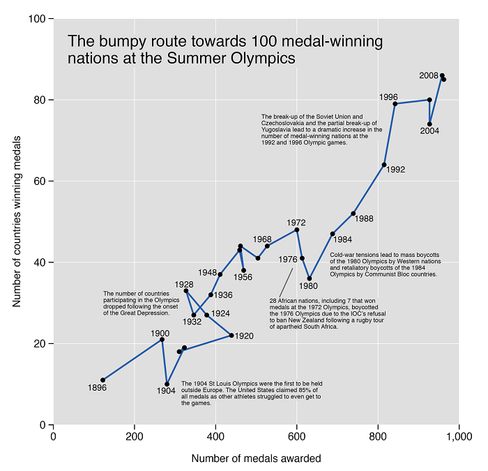
Example of contextual annotations in a chart. Source
Explainer Videos
Big data often involves intricate and multilayered information that can be challenging to grasp. Explainer videos help break down these complexities by using clear, concise language paired with visual aids. This simplification makes it easier for the audience to understand the core message without getting lost in the details.
“Explainer videos are an essential tool for companies looking to bridge the gap between technical and non-technical teams. They make it possible to communicate complex data insights in a way that’s engaging and easy to understand,” says Victor Blasco, CEO of the explainer video production company, Yum Yum Videos.
Visual Rhythm
This is particularly crucial for visualizations involving infographics, explainer videos, or any form of animation. Just as in music, pacing in a visualization can control how information is absorbed. So, consider introducing rhythmic elements, such as alternating visual intensities or patterns, that can create a visual “tempo” that guides the audience.

An example of good visual rhythm at work is Google’s 25 Years in Search data presentation, which showcases the most prominent events and people in history by crunching data from Google Search over the past 25 years. The audience, composed of Google users doesn’t need to be bogged down by numbers; all they need is the information, in an accessible format.
Ethnographic Visualization
Visualizations must be culturally and contextually relevant. This might mean using culturally specific symbols, colors, or design elements that resonate with a particular group.
Such ethnographically informed visualizations can foster deeper connections with the data. When stakeholders see their cultural references or familiar symbols in the visualization, they are more likely to connect with the data and find it relevant to their concerns.
Subtle Use of Sound
In interactive or digital visualizations, the addition of auditory cues can guide the user’s attention or signal important changes in the data. Soft, ambient sounds tied to specific data points or trends can enhance the user experience without overwhelming them.
These cues can also be used to subtly guide stakeholders’ attention to important data points or to signal significant changes without overwhelming them with visual clutter. This multi-sensory approach can make it easier for non-technical users to follow along and understand the key messages within the data.
Conclusion
If companies must unlock the full potential of their data, they must enable non-technical stakeholders to make informed decisions that drive innovation and growth. Effective communication is not just about presenting data; it’s about telling a compelling story that resonates with the audience and empowers them to take action.
With this approach, you can bridge the gap between technical complexity and strategic decision-making, ensuring that the insights gleaned from big data are accessible to all, regardless of their technical expertise.
The post Leveraging Visuals to Simplify Big Data Analytics for Non-Technical Stakeholders appeared first on Datafloq.
